Why We Switched From Photoshop to Sketch
5
minute read time
Over the past 5 years, the digital world has been rapidly evolving and changing. What was once a world of desktop websites with separate mobile experiences, is now a multitude of fully responsive websites that function on any screen type. Even since then, the use of complex animations and transitions have upped the ante in web design, creating incredibly interactive and visually stimulating experiences. With this quick advancement of technology, the digital design world needed a program that could keep up.
Since the beginning of (design) time, Photoshop was the go-to tool for UI design. It was the only program out there that seemed to meet the needs of designing a fully responsive website. That is, until Sketch was released.
“Designing UI in Photoshop is like using a chainsaw to cut paper when all you need is a pair of scissors.”
Baz Deas, Product Designer
Around mid 2015, we started hearing buzz around new applications and programs for UI design. This was exciting to us, as a digital focused agency, to hear that new programs were being developed to better serve the digital design community. One program that really stood out to us was Sketch. We had read a handful of articles talking about the new tool and people’s experiences with it. We even knew a few colleagues in the same industry who had tried the new program, expressing their enjoyment with its interface and functionality.
In August 2015, we finally made the switch from Photoshop to Sketch. We knew we had to bite the bullet and learn a new program (shortcuts and all), in order to further our education and improve our skills. This was exciting, but also intimidating, knowing we’d have to go from knowing everything about Photoshop, to know nothing about Sketch.
To our delight, Sketch was very intuitive, and mimicked a lot of the same features and capabilities that both Illustrator and Photoshop had. But that’s only part of it. Unlike Photoshop and Illustrator, Sketch was built for UI design right from the start. It had tools and capabilities that a UI Designer only dreamed of when working in Photoshop. Not only was it more robust, but it was also way more efficient.
The first feature that stood out to us was Symbols. No longer did we have to update the navigation in 10 different Photoshop files when the client decided they wanted the logo “just a little bigger”. In Sketch, if changes are made to a symbol, it will update anywhere in the document that symbol is used.

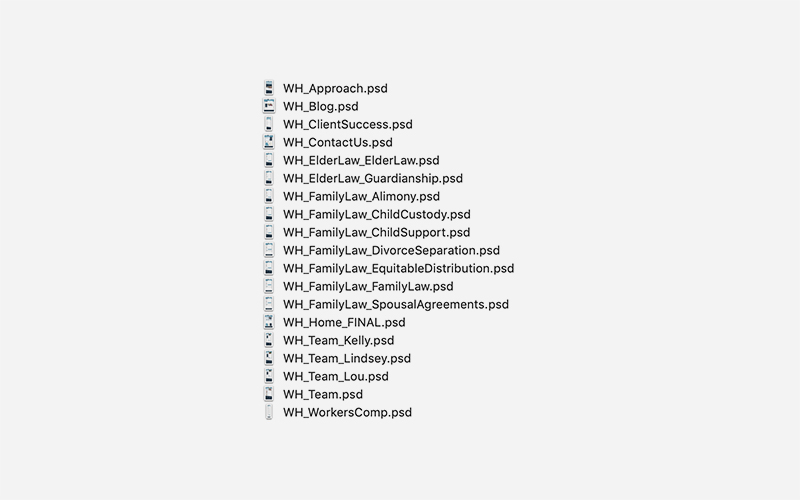
How about file organization? In Photoshop, there are no ways to organize pages, nor could we house an entire website in one file because it would be incredibly large. Sketch is a vector based program, making file handling in terms of size much better. Gone are the days of separate Photoshop files for each page of a website.
.jpg)
Sketch's autosave feature has given us a sigh of relief. We've fallen victim to pouring hours of work without remembering to save files and boom, Photoshop quits (insert mini heart attack). Working with large files, and having multiple programs open makes this inevitable from time to time, but with Sketch, our worries are lessened. The auto-save feature continually saves the file as changes are being made. Sketch also gives users the ability to go back to previous versions. Now we're able to reference an old iteration or bring back accidentally deleted items.
Sketch's autosave feature has given us a sigh of relief. We've fallen victim to pouring hours of work without remembering to save files and boom, Photoshop quits (insert mini heart attack). Working with large files, and having multiple programs open makes this inevitable from time to time, but with Sketch, our worries are lessened. The auto-save feature continually saves the file as changes are being made. Sketch also gives users the ability to go back to previous versions. Now we're able to reference an old iteration or bring back accidentally deleted items.
Now although we’ve moved from Photoshop to Sketch, it’s not necessarily a catch-all. Adobe Illustrator and Photoshop are still a big part of our every day toolbox, and serve important purposes to the overall design. Illustrator is best suited for complex illustrations and icon creation among other things, and even though Sketch is a vector based program, it wasn’t created to replace a solid vector application like Illustrator. Photoshop is also essential for any image editing, sizing, and saving.
Since switching, it's apparent that Sketch has increased efficiencies for us in both the design and development stages of our projects. With a vast plugin ecosystem, and constant software updates, the program is continually evolving with the digital world, and we’re excited to grow with it.

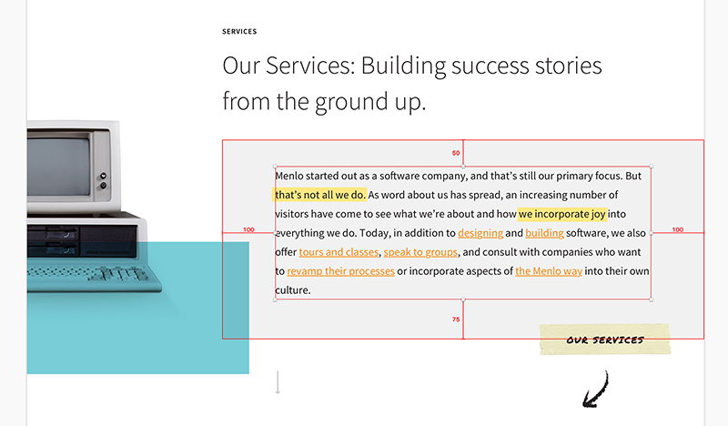
We can’t forget the developers in this conversation. Our websites would be mere pretty designs on a screen if it weren’t for our developers, so naturally we wanted to make sure this tool would improve their workflow as well. The ability to accurately measure elements and spacing in Sketch has eliminated the “guessing” game they once knew all too well in Photoshop. This has significantly improved accuracy and speed when determining things like padding, margins, and spacing.

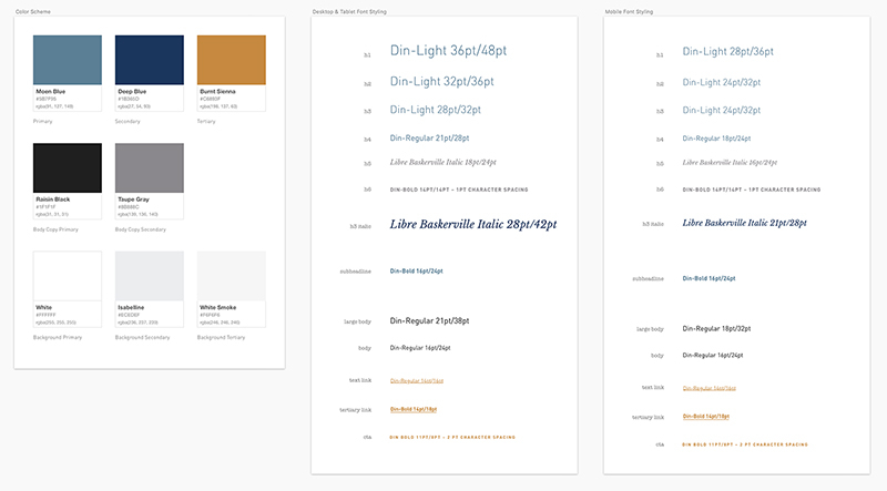
The use of symbols, document colors, and text styles has encouraged our design team to adhere to defined styles, making it easier for developers to identify consistencies. This eliminates common questions like “Did you mean to make the H1 smaller on (insert page name)?”. And similarly to symbols, if you’re halfway through a project and need to make the subheadline style just 2pt larger, this will update in all instances throughout the document


