Guide To An Awesome Rebrand
15
minute read time
So you’ve decided it’s time for a rebrand. Maybe you’re excited to begin this process and see what cool ways we might reenvision your brand. Or maybe, you’re a little bit nervous because your brand is what you know, love, and built yourself, and you’re starting this process with a lot of hesitation.
No matter which end of the spectrum you’re on, welcome! This is a really exciting time in the history of your brand, and we’re honored you trust our expertise to help you shape your brand into what it could be.
What is a Brand?
Contrary to popular belief, your brand is more than just your logo. Branding encompasses the tone, look, and sentiment a person gets when experiencing your brand across mediums. Take, for instance, Coca Cola. What comes to mind when you think of Coca Cola? Nostalgia, warmth, refreshment, joy. The goal of their branding is for you to feel that every time you interact with their brand—pick up a bottle/can, see it in the grocery store, watch an ad—you associate that same nostalgic joyful energy that makes you crave Coke. The friendly, retro script you know as the Coca Cola logo aligns perfectly with these characteristics.
So while your logo does matter and is a key part of your brand, it’s just one piece of a big puzzle. I love this quote by Michael Bierut, partner at Pentagram, because it sums up the role of a logo so well.
“When we look at a well-known logo, what we perceive isn’t just a word or an image or an abstract form, but a world of associations that have accrued over time. As a result, people forget that a brand new logo seldom means a thing. It is an empty vessel awaiting the meaning that will be poured into it by history and experience. The best thing a designer can do is make that vessel the right shape for what it’s going to hold.”
Michael Bierut , Pentagram
I recognize that this could all sound well and good, but you may be thinking, “I get it, but my logo means so much to me! It’s represented my business I’ve built from the ground up for the past 5 years.” I totally understand that! Your logo is a really personal part of your brand so you may be a little picky or nervous at the idea of changing it. Let us know your hesitations and what you love or dislike about your current logo.
What if I have no brand right now?
That’s ok and we’d be glad to help you with that too! All of the thinking below is still a valuable place to start for branding your business and thinking how it’ll come alive visually and tonally.

Where are you going?
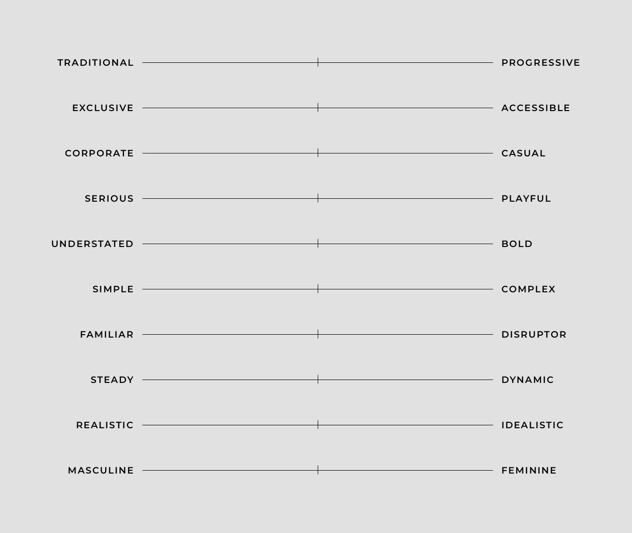
It may be easy to think and talk about your brand today but we want to build you a brand that grows with time. Where do you imagine your brand will be today versus 5 years from now? To get a gauge on this, start by placing X’s where your brand falls today.
Now, place X’s where you see your brand in 5 years.
Here are some additional questions to ask yourself about your brand and its direction:
- How did your company start?
- What makes your company successful?
- Did your family history influence the start of your business?
- What are the core tenants/values of your business?
- When and how is your brand perceived incorrectly?
- What do your competitors look and feel like? Do you feel like your branding is on par with them?
- What logos/branding do you like the look and feel of (outside of your industry)?
Who are you reaching?
You may have the mindset of “I’m open to working with anyone I can get to come through my doors!” However, your offerings, logo and messaging tone are probably attracting a certain type of clientele. One of the services we provide here at Atypic is helping you develop primary, secondary, and tertiary user personas. Personas can help you serve as filters for making design decisions for your brand.
For example, Starbucks’ target audience appears to be millennial females with busy lives on the go. Their messaging is self-described as “functional” and “expressive.” The functional, matter-of-fact tone appeals to the target consumer on the go—they need to understand what Starbucks offers fast and clearly. The expressive tone is seen with their tongue-in-cheek ads that nod to millennial jargon.
Here are some questions to kickstart your thinking on who your target audience is:
- What’s their age range?
- What advantage does your product have for them over other products in your category?
- Where do they shop? What brands do they buy?
- What do they find joy in?
- What is the worst part of their day?
- What’s their income range?
- How much education do they have?
- Where are they located?
Analyzing Your Brand
To start things off, we need to do a deep-dive and ask all of those questions you’ve maybe never thought about. Some important things to keep in mind here:
- Do not rush through this process because we want to build you a brand that stands the test of time—not something you have to change next year.
- You are your brand’s expert! You may need to consult your marketing team or a small core team at your business, but try to limit the opinions guiding your brand. Your mother, your cat, your aunt’s best friend from college do not need to have a say in where your brand is going.
- Try not to compare yourself to Apple, Nike, or any big famous brands you may aspire to be. While we do want to know what brands you admire, keep in mind how similar they are to your brand and its audience.

Evolutionary versus Revolutionary Rebranding
Look back to your answers on the brand survey, if your “Present” and “5 Years From Now” X’s are pretty similarly located and/or if you plan on your target audience staying the same, an evolutionary rebrand is a great place to start. If you want your brand to look and feel pretty different 5 years from now, a revolutionary rebrand is potentially what your brand needs

Evolutionary Rebrand: Equity is King
A total brand overhaul isn’t needed but more so, you need to make some tweaks to make your brand seem more current but still keep the brand equity it currently has. Some evolutionary changes could include:
- Freshening up your logo by keeping the same overall form and feeling but changing things to feel more modern and clean
- Introducing a new campaign that capitalizes on and enforces brand values while introducing some new imagery and feeling into the brand
- Creating an updated website or product packaging to something that feels more modern but still on brand for you
I think the goal of an evolutionary brand should be to get the consumer excited and invigorated about a brand they already know and love. It feels like a breath of fresh air or face lift.
Here are some great examples of evolutionary rebrands: Dunkin’, American Express, Atlanta Humane Society, Lufthansa.

Revolutionary Rebrand: Brunette to Platinum Blonde
You’re ready for something completely new and we’re excited to be your guide into these uncharted waters. Your brand is making a pretty big pivot to attract a new type of audience. I think it’s extremely critical for this type of rebrand that you’re willing to re-do everything together. A piecemeal rebrand can be really confusing for a consumer. Here’s what all should change:
- Your logo, collateral (business cards, letterhead, envelopes), TV ads, packaging, website, color palette, tone, social media feeds—basically every touch point your consumer has with your brand
The goal of a revolutionary rebrand is to see a friend with a new hair color and absolutely love it on them. It feels fresh, new and current. Perhaps you never imagined them with that color hair but you’re pleasantly surprised how well it suits them.
Here are some great examples of revolutionary rebrands: Chobani, Library of Congress, Century 21.
Is it possible to have an evolutionary and revolutionary rebrand?
Yes, these options are definitely more of a spectrum than two binary options. For example, we could keep your current color palette and typography but introduce a logo mark that’s pretty different from what you have now. Uber is a good example of a rebrand that definitely feels like a noticeable change but still retains a lot of elements from previous versions to keep that brand equity.
Conclusion
How to End Up With a Lasting Brand You Love
The two keys to a great rebrand are honesty and trust. You have to be really honest with yourself on where your brand is going. Sometimes it can be challenging to separate your personal preferences with what’s good for the brand. Or sometimes it’s hard to imagine your logo changing because it has represented you and the company you’ve built for so long. Like I said earlier, we’re honored to be helping you through this journey and helping you dream about what your brand can be. That’s where trust comes into play—we’re experts at what we do and need your trust that your brand is in good hands.
As a designer, we address these processes and questions everyday. If you’re interested in Atypic branding or rebranding your business, contact us about our design services.


