Fusion Conference: Design Edition 2019
15
minute read time
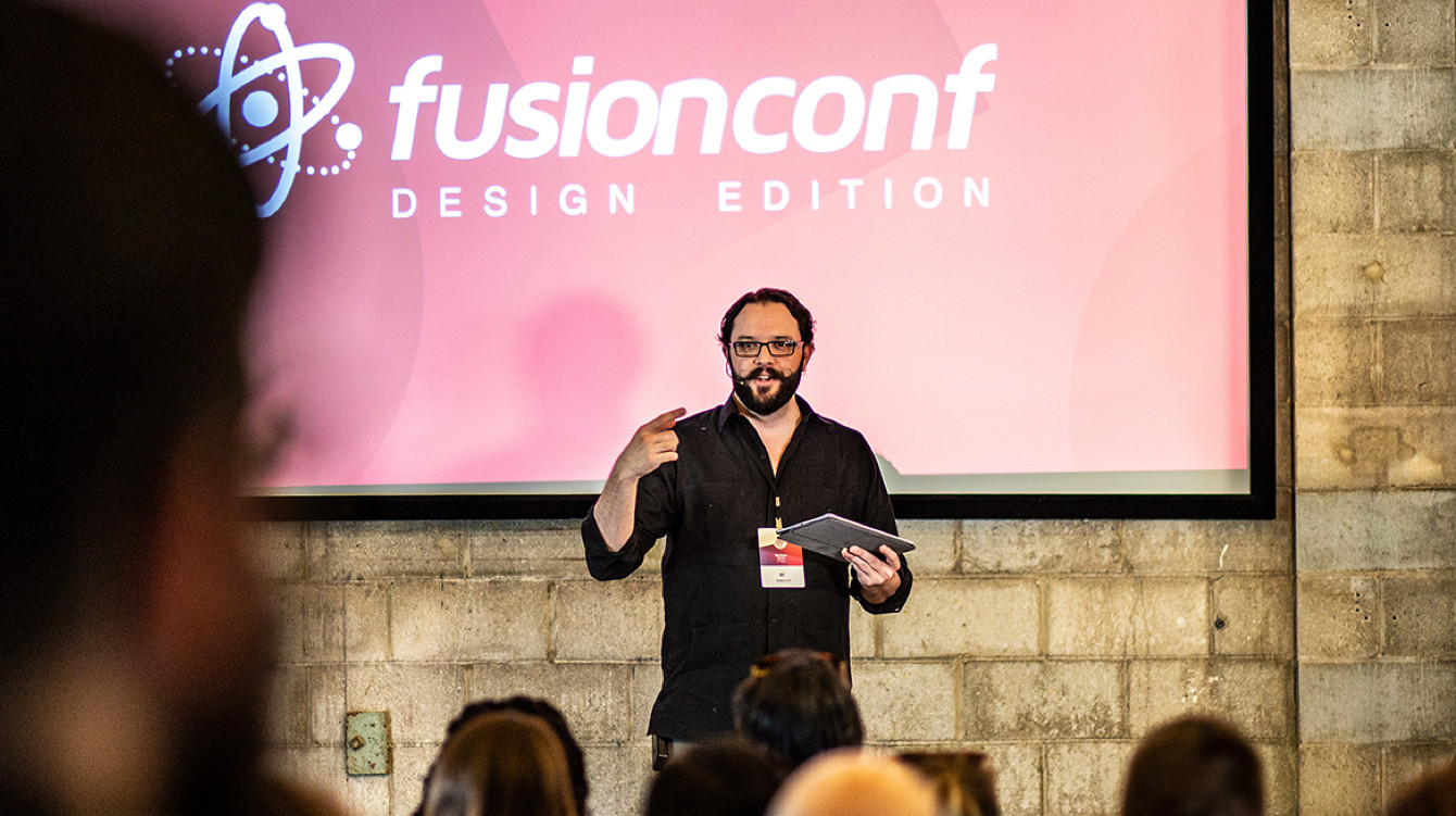
I was so excited to attend the summer Fusion conference this past month since it was my first conference ever!
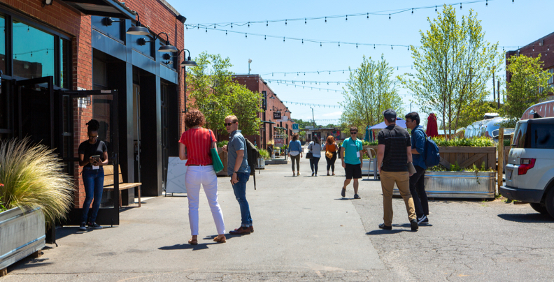
Fusion is a Charlotte-based quarterly mini conference that focuses on web design, UI/UX, and development. It was awesome to be surrounded by fellow creatives who are passionate about website design and finding better solutions. Plus, Camp North End is a super cool location and it’s hard not to feel creative just being there.
This summer conference was specifically centered around design systems. I went into the conference assuming I knew what design systems were and, come to find out, my experience with and definition of design systems was just the tip of the iceberg. Almost all of the speakers began their talk with their own definition of what a design system is; and by the end of the conference, I felt like I had a pretty firm grasp on what a web design system is, the benefits of one, how it can fail and how to implement one.

What is a design system?
A design system is a living product that combines design and development into a library of coded components and styles with usage guidelines to be used on your website or app. What makes it living is that a design system is never fully finished and is always evolving and expanding. It allows you to establish a common language between design and development and rapidly build websites that are consistent, efficient and still creative.
Being a designer, I’m a visual person so seeing actual examples of a web design system versus a description made things more tangible and understandable to me. Here are some great examples:


My first thought when seeing these was that a design system is essentially a super extensive and more adaptable brand standards document. We create a brand standards document for a client after a rebrand and provide usage guidelines for their new typography, colors, patterns, tone of voice and logo system. A responsive design system provides the same sort of structure to a website but also includes coded components making it a repository for front-end developers.

The Pros: Efficiency
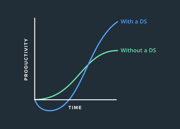
It takes a lot of time and effort to start your system, but when done right, is an extremely helpful tool for your web design company. Once the system is robust enough to be used, productivity skyrockets. Without a responsive design system, your productivity eventually plateaus. But with one, it continues to increase as the system grows and more people rely on it.
The Pros: Consistency & Building Brand Trust
While internal productivity is a great benefit, some people still may be skeptical because a responsive web design system may seem like a costly investment that won’t affect the user or get converts.
But consider website experiences you’ve had where you think, “Hmm, this is sketchy. I don’t know if I trust this retailer/brand.” What causes you to have those thoughts? Inconsistencies in the site layout or branding are subtly logged in our brain and build a sense of distrust. If all of the pages feel completely different and disconnected, you’re not going to trust that retailer with your information or to provide you with a quality product. Take for instance websites like Apple and Nike—design elements are consistent on each page and everything feels cohesive and on-brand for them
The Pros: On-boarding
Whenever you hire someone new, there is a great cost to training that person. Especially in an agency setting where each person has to get acquainted with each client and their brand’s look, needs, and feel. Ben Callahan and Catherine Meade from Sparkbox both testified to how much quicker on-boarding is with a design system. At Sparkbox, they actually have a dedicated team for website design systems and have each new hire start there before moving to their team. This gives everyone a solid foundation and understanding of the systems across disciplines increasing buy-in and use.
“Preventing chaos is an essential goal of a Design System. What chaos? The chaos is in each designer making minute changes to your Product. A new shade of grey here. A different line thickness there. Although they seem small, these changes add up over time, creating what we call Design Debt. Tiny differences adding little value, while creating an inconsistent experience and bloated code.”
Ian Black , From Medium
Every time you hire a new designer, they have new ideas for type, color, layout and components. And while sometimes that creative freedom is good and necessary, other times it can really eat into development time and decrease the brand’s consistency.
Well if this is so awesome, why doesn’t everyone do it?
It takes a lot of work, time and buy-in to get a responsive design system started and to get everyone onboard with it. Presenters kept coming back to the fact that design systems generally fail for people-reasons not tech-reasons. According to Sparkbox’s 2018 Design System’s Survey, it’s essential to have a cross-disciplinary team of champions fighting for this and reminding people of the benefits. Your champions will have to get your team to be ok with these facts:
- It’s going to be a costly and timely investment to get your system off the ground
- It’s not going to work if there isn't a dedication to using the system–we need full team buy-in
- It will never be totally done because it should always be evolving
Conclusion
How would you use a design system at an agency with different clients?
This was the question ringing in my head during the whole conference. At Atypic, we are a small agency focused on digital experiences and have a wide variety of clients and project sizes. Some digital experiences are a few pages while others are much larger in scale and more on a retainer basis. Do we need a design system for each client and project?
For smaller scale projects where only our team is involved, I don’t think it’s necessary. We’re in a pretty good habit of keeping our Sketch files organized and consistent and talking to dev about where we can reuse code and components when needed.
But for larger scale and retainer projects, it’s an excellent service we offer, especially when we’ll be designing the main framework and passing off the finished product to that client’s designers and developers for them to use. For one of our current clients, our development team has worked with the client’s developers to create a responsive design system for a large brand. This has enabled rapid web page development and design while keeping the brand image consistent. Our team has loved working on this project because we’ve learned so much and pride ourselves on exploring and implementing industry trends to both maintain our edge and fit client needs.
Thanks!
Thanks again to all of the organizers and speakers from the Fusion Conference!
It was an awesome event and I’m grateful for the knowledge and connections made. Special thanks to Bermon Painter for the images used and Ben Callahan for allowing me to use the graph from his presentation.
Does a design system sound like a good fit for your company?
Let us help your company stay on the cutting edge and boost your team's productivity.
It’s essential in the early planning and building phases to make sure you’re meeting with the people who will be using this system (especially if you’re building this for a client and not for you and your team.) And then ask yourself: What are their current issues with their process? To get buy-in and maximize efficiency, you need to make sure the system addresses their problems and is more effective than their current process.


